Mike Ashurst:
Welcome everyone. Today we focus on catastrophe modeling. I’m very pleased to hand you over to our speakers today, Tim Fewtrell, who is Executive Director, Head of Catastrophe Analytics at Willis Re. We will also have Ditte Deschars, who is Regional Director, Head of Willis Re Nordic. Over to you, Tim.
Tim Fewtrell:
Thanks very much, Mike. Welcome everyone and thank you for this time to talk about how well cat models represent both the past, the present and potentially the future. This leads on from a seminar we did back in April for ICMIF with members around how we could approach catastrophe analytics for the future. But I wanted to take a step back in this one and look, if we’re going to attempt to address the future, how well do cat models currently even represent the climate and the situation that we’re in today.
Now, as Mike said, we’re going to kick this off with a little poll. I wanted to run a little bit of experiment. I should say, right from the start, you can see the little footnote in the bottom right-hand corner. I have shamelessly stolen this from an individual called Richard Dixon who used to work at Hiscox and now runs a company called CatInsight. I saw this in a presentation, I thought, “I’m going to steal this and use this for this seminar.”
The question that I’m asking is, “Which of these three data sets or data series exhibits a trend?” You’re about to get a polling question and just the choices will be top, middle, bottom, or D, something else. We’ll leave this up there now and as Mike said, we’ll flip to the poll now and I’m just interested to see what comes from this poll.
I’m guessing now we’ve got an answer. Wonderful, that’s great. I hope you can all see that. About 50% of you think it’s the middle time series and 25% of you think it’s something else. Excellent. If we can flip back to the slides.
Now I’m going to have the joy of revealing the answer. I’m really pleased to say that 25% of you we’re bang on, it’s something else. It was a bit of a trick question and it was a bit unfair really, because actually all three of these datasets or data series were taken from the same data set. That really brings out two things that I want to call out today.
The first one is, when we’re looking at trends in data, it really matters what the context of that data series is. Are we looking at a complete series? Are we looking at a series that truly represents the phenomenon that we’re looking at? Or are we actually only looking at a snapshot? That’s really, really very key and we’ll explore that in a little bit more detail.
The second thing that I wanted to this highlights here… and what we’re looking at here is the global annual temperature. Going back all the way to 1880. I think we’re all very aware that global warming is happening. Climate change is happening in the world, the earth is getting warmer. This is not a phenomenon that is that debatable or unusual, should we say. We’re all very familiar with it. But is it quite so straightforward for all of the other natural phenomenon that we model with catastrophe models? That’s where I’m going to spend a little bit of time starting on and really other phenomenon are really not so straightforward.
Now let’s start on the left hand side here. If we start on the left hand side at the top, and what we’re looking at is the number of tropical cyclone. So tropical cyclone activity, hurricane activity in the North Atlantic. In the green bars, that’s the number of big hurricanes and major hurricanes category three and above, and the green is the minor, red is the major hurricanes.
If we were to simply take that time series and look at a trend, that’s the black line and you go, “Okay, since the late 1800s, there is an increasing trend in the number of tropical cyclones,” straightforward, simple. Then you go, “Well, hold on a minute, we’ve got a hell of a lot better at recording these things and tracking these things in much more recent history than in the further history.” Really that’s come from the advent of the satellite era, if you like.
That’s what we’re then looking at on the bottom graph there, where the green line is just the total number of hurricanes without doing any adjustments. The orange line, in fact, is adjusting the total number of hurricanes to account for the fact that we’ve got so much better at recording them.
Looking at that box on the top right there, confidence remains low for longterm changes in tropical cyclone activity, especially when we account for changes in observing capabilities. But it is very clear that since the 1970s, there has been an increase in the frequency and intensity of storms in the North Atlantic. The key there is, is actually, we don’t know why. We don’t know what that causal mechanism is. There are a lot of reasons for that potential increase.
If we look on the right hand side here… this is one study looking at the number of hail events across Europe. Really depending on the data source that you use, you’re going to get a very different picture of that phenomenon. Why is that? Well, hail events are very localized. If we were to use as has been done here, what’s called re-analysis data, which is taking all of the observations as well as taking a modeled output to try to reconstruct the past. If we compare that view to a view where we’ve only used the station data, we actually get a very different view.
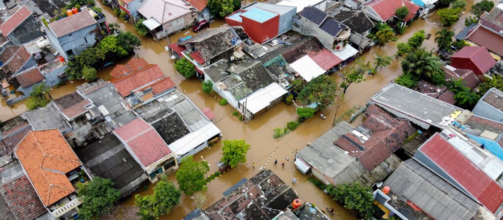
If we then think about other phenomenon, let’s talk about floods. There’s also the matter that it’s not just a straightforward to say, “Well, we’re getting more of them and they’re getting more extreme.” Well, actually hold on. There are going to be different changes in the frequency and different changes in the severity. Those two things are not necessarily a one-to-one coupled and one-to-one related.
When we think about our cat models, we’ve got to make sure that any cat model that we’ve got fundamentally, appropriately represents the current climate, the variability in the current climate. So any variability that we currently see in frequency and severity. Then that it actually represents any losses we’ve got particularly well.
Before we start moving in and thinking about, “Well, we’ve got uncertain projections of climate change. We don’t actually know what the climate is going to do, but we’re going to use the cat model that we’ve already got that potentially we’re not 100% positive about, because there’s all this variability, but we’re going to use that anyway.”
I just wanted to frame this and thinking about there’s a lot of these things going on here, and we’ve got to make sure that we’ve got a good handle on all of those before we start worrying, or before we start thinking about, “Well, what’s the delta, what’s the impact under climate change.”
I’ve split this presentation up into, broadly speaking, three parts. I decided to use Charles Dickens as my inspiration. We’re going to look at the ghost of the past, the ghost of the present, and the ghost of what is yet to come. Let’s start with how well the cat models actually represent the past. I’m going to be really unfair with my first example.
I recognize this is an unfair example, but I thought it was a fun one to do anyway. Let’s look at how well a cat model can represent something that happened in 1700. What we’re looking at is an earthquake on the Cascadia Subduction Zone. So Northwest coast of the US, Washington, Oregon, and California. On the 26th of January in 1700, there was a giant magnitude nine earthquake in that Cascadia Subduction Zone. We know a lot about that from all of the ways that we can record and see the evidence of historical earthquakes.
Now, that was one of the biggest, that was really quite substantial. How well can our current crop of cat models actually represent that event? As I said, I know I’m being wildly unfair here, but I think you can all see that, let’s take two cat models that are currently available for earthquake risk in North America. We go from a minimum estimate of a 30 billion loss.
That’s really an earnings’ event for us as the reinsurance community. Maybe there’s minimal capital erosion there, but really that’s not going to change the world. All the way through to a potential of a 300 billion loss from this an event. That’s substantial market disruption, as we can see.
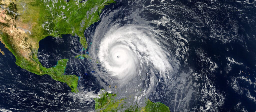
How are we going to use these cat models when that’s actually the range. Now, as I said, I’ve been purposefully unfair with my first example. Let’s bring it slightly closer to today to see how cat models do slightly closer to home. Let’s go with something that we’re all relatively familiar with, windstorms across Europe. We get about six or seven of those major ones every winter season. Those of us who live in Europe are very well versed with them and are pretty used to them.
Most catastrophe models that we use today, incorporate some representation of large historical events. What we’re actually looking at here across the top is three different representations of the Kyrill Storm that happened in 2007. We’ve got two models on the left and then we’ve got some work that we, at Willis Re, have done with our Willis Research Network partners. For argument’s sake for the moment, let’s treat that one on the right-hand side as the truth, purely for argument’s sake.
What you can see is that there are two very different depictions of that event in model A and model B. They’re different from each other in terms of where the peak wind speeds is, how high the peak wind speed is, what the distribution of wind speeds looks like geographically. But they’re also substantially different from, let’s call it, the ground truth on the right-hand side.
You would expect that. There is variability in model methodologies, there is variability in the historical data used to construct these models. But at the same time, that’s some very, very large variability and very large differences.
This is increasingly important. Now that regulators are really mandating us in Europe, at least, to have a really good handle on that model validation component. Generally speaking, as practitioners with cat models, what do we like to do? Well, we like to break down every single part of the model and validate that model component. We do that because a, as scientists, we like to do that and everybody likes to make sure that every bit of their model is right. But we also do that because regulators mandate that.
But looking at these examples, and this is an event that happened really relatively recently with very good data, should we actually only consider our models as loss models? Should we not worry about how good they are at actually representing individual events? Let’s take a look at that idea for a moment. So if we’ve said that there’s good data, but maybe we don’t get the footprints quite right. There is a lot of data on loss.
Let’s take a look at how well cat models do at estimating these large historical losses. I’m going to stick with European windstorms here, because there’s a decent amount of data. We’re looking here at important events from the past going from 1990 through 1999, and then some more recent storms in Kyrill, Klaus, and Xynthia.
In the red, you’re looking at the range of observed loss estimates to the industry. I’ve indexed those up to 2020 from a variety of sources. Then we’re comparing that to the green box plots that are a combination of model vendors and model versions. What you can see, if you’re looking at those pinked ringed ones, is there are substantial instances where the modeled range lies outside the actual range. How do we then go forward with using a cat model? There’s not even a pattern here that says, “For a given magnitude or for a given age, that were outside the range or within the range.”
Now, there is a small aspect here that’s worth a footnote in order to ensure there’s no bias in the underlying exposure data that we’ve used, we’ve used our own view of the industry exposure data for all of the vendors on all the models that we’ve used here. There is an argument say, if we had potentially used the industry exposure that the catastrophe model vendors used when they develop their models, you might see a different picture here because this is a test that they will go and do. However, it’s surprising to see such a large range.
Also, you’ve got to bear in mind that there will be different views of indexation, and that will have some impact, especially the further back we go to say 1990. But still, this is an interesting phenomenon. So how can we use these catastrophe models if we can’t appropriately back test them against history? This is just some things to think about historical events.
Having trashed models… well, maybe trashed is the wrong phrase. Having brought into question models of the past, why don’t we have a look at the present. To be fair, the only way to look at the present is to look at the present and the recent past. I’m going to stick with European windstorms again. I’ll come back to earthquakes and some others in a moment, but this is a topic close to my heart.
As I said earlier, there’s roughly six significant storms per year in Europe. We get roughly an average annual insured loss of around three billion, something like that. Now, if we look here at the data that’s usually used to underpin catastrophe models. Back to the early, mid, late 1970s, that’s when we think the data’s reliable enough to construct a cat model.
You can see that, if you look to the period 1976 to 2006, you’ve got 18 storms there excess of 1.5 billion at industry loss. Again, we’ve indexed these. If you then look at the period 2006 to 2017, there’s actually only two over that threshold. So taking that into account, it looks like 1976 to 2006 was roughly four times more stormy than the 2006 onwards period. Actually, there’s a lot of studies out there that support this idea that the recent climate may be more indicative. That this ’80s, ’90s was a bit of a blip in the record.
How do we use a model where potentially it’s being built on historical data that has a different pattern from the pattern that appears to pervade for a longer period? Let’s dig into this in a bit more detail because this is actually fundamental.
We’re very lucky that in the UK, we’ve actually got quite a lot of data. Now, I’m pulling this back to just looking at the UK for a moment. We’re looking at, roughly the same period again. The late 1970s to now. I’ve called out three substantial storms that hit the UK and some hit the rest of Europe. Because we don’t have wind speed or we don’t have loss going back much further, we’ve expressed these in terms of what’s called, a storm severity index. It gives you an indication of how big and how severe that storm was.
We’re very lucky that in the UK we can extend that back using some work done by Palutikof and colleagues. What does that look like? Well, that’s all the red dots that we then added to our black dots here. You can see very clearly, that actually this period of the ’80s and ’90s look substantially more active than the period post 2006, but also the distant past.
We’ve got a bearing, we’ve got to take this into account when we’re thinking about the frequency that the models are suggesting and the severity that models are suggesting for the longer time period. What does this mean for our model view of risk? Are we appropriately taking all of this stuff into account now?
As I said earlier, that’s looking at the phenomenon. But let’s start looking at losses and let’s call out and look at a couple of countries in particular. I’ve just got idealized portfolios here. I’m looking at France and Germany. How well does the model represent the recent past?
Just to explain what we’ve got on the graph here, in purple is one of our cat models that we’re all very used to using. We’re looking at return period on the Y-axis and loss on the X-axis, apologies that is potentially the other way around from the way you’re used to looking at it. Bear in mind as well that the return period here is on a log scale. That is important to recognize. In purple is one of our cat models that we’re used to using.
In red is a historical OEP curve built from the historical events that are represented within the catalog that model A has. You would expect the red line and the purple line to marry up pretty well, because that’s the basis for the model that they’ve built.
In green is taking client losses for that same… for their historical losses and an OEP curve that we can build from their historical losses for roughly the last 20 odd years. What you can see here is that there’s a marked difference between how well the model performs in France and how well the model performs in Germany.
In France, has this particular season been unlucky potentially. They’ve had a much worse loss history than you get from the model. Whereas on the right hand side for Germany, actually has this client been lucky or actually is the model overstating the losses that they potentially have. Bear in mind, this is on a log scale. That’s quite a difference. Solvency too requires that we do really good back testing.
Therefore, we’ve got to make sure we have a robust representation of the recent past. The recent past is the period where data quality should be at its best and model confidence should be highest. Yet, for two countries that are very much prone to European windstorms, have some of the largest insurance markets in Europe, and yet still we’re getting this mismatch.
Rather than looking at just France and Germany, individual countries, let’s try and look at Europe as a whole, and again, I’ll stick with European windstorms just for a moment. Let’s look at observed versus modeled loss ratios. What we’ve done here is we’ve taken a composite treaty portfolio. We’ve taken a wide range of our seed across Europe together with their claims data, their modeling output, and we’ve rebuilt up this composite view.
What we’re doing here is we’ve also got about 20 years of loss history. What we can do then is we can simulate many, many thousands of potential 20 year periods from within a cat model as well. So what we are looking at there on the graph is the range of loss ratios that we get for, on the right hand side, the right two are the observed set of data that we’ve got. On the left is doing that simulation of many thousands of about 20 years from a cat model.
Looking Europe wide here, the first thing that you notice is that, let’s just look at the red versus the green for a moment. As you see a really big difference between the average loss ratio in the model, 127% to 46%, if we take the observed. Actually, if we say, 1999, where we had Lothar, Martin, and Anatol, that was a particularly bad year. Let’s just see the sensitivity to this if we take that out.
The average loss ratio for a European wide treaty book, when we do that is down at 7%. What does this mean? Well, what we’re looking at here is then that modeled loss ratios for European windstorm are significantly above the recent history and the recent experience that we’ve had. How do we reconcile this and how do we go and look at the impact of climate change when we’ve got such a large discrepancy potentially between what the model says and what we’ve actually observed?
Now, bearing in mind, the actual model here contains substantially more severe and larger events than we’ve experienced in the past, as you would expect, because you want to look at that tail risk and we’ve not potentially had a one in 200 or one in 500, or you might even argue with not even had a one in 100 year style events that often. But that’s a substantial discrepancy and a substantial difference.
Just to make sure that I’m not only doing this on European windstorms. Let’s take a step back and let’s start looking at some other perils as well. I want to flip back and look at earthquakes because we’ve discussed here about how well does it represent maybe the storminess or how well do we represent the loss. But there’s also that aspect of, “Well, are we even representing the right phenomena within the come world?”
Let’s look at earthquakes. I’m not even going to look here at say, some secondary parallels like liquefaction or a tsunami as a result of an earthquake. I’m not going to look at those. We’re just going to say, if you like the core peril and let’s stick with that.
In earthquakes, there are three things that we need to think about on top of just the ability to model a single earthquake appropriately. That is, is there some time dependency, longterm dependency, and cyclical nature of earthquakes? Is there some cycle on the fault that we need to represent? Generally, is that modeled? Well, sometimes. In the newer models, where we’ve got the data to support it, but it’s not always the case.
The second thing here is, well, let’s worry about aftershocks. There might be a surgeon seismicity after the earthquake in proximity to the main epicenter and the main shock. Do we model that? No, we don’t. Why does that matter? Well, you might need some more sideways cover.
Finally, this one is some work that we’re doing actively within our Willis Research Network is actually following an earthquake. There is substantial redistribution of stresses and strains within the Earth’s crust. That can actually substantially change the probability of earthquakes occurring on nearby faults. Do we model that? That’s never modeled.
If we think about model updates cycles, and this is no criticism because having built models in my time, I know how long it takes to build a model. But model release cycles are two, three, four years. How do we then adapt to the fact that, in the few months after we’ve had an earthquake, there may be substantially increased or in fact, decreased probability of an earthquake coming next.
That can have some real impact on assessing your vertical limit. If you know that the stresses and strains have gone down, well, do you need to buy as much. Now, I’m not going to sit here and advocate buying less necessarily, especially in the world that we live in now, but that’s something to think about.
We’ve not only got to think about whether it captures trends, but does the model even include everything that we needed to? That’s some reflections on if you like the past and the current present, but there is another way in which we use cat models. That’s to assess light events.
How well do cat models even do at assessing live events? Let’s be really clear, cat models are not designed to model live events. That’s not what the therefore. However, bizarrely, we as practitioners, we actually expect cat models to be able to do that. Not only to be able to model a live event, which by the way, we’ve never seen before, we’ll never see again and in its exact form will not be in a stochastic catalog that a model has created. But we still expect it to be able to give us sensible loss estimates.
What we’re looking at here on the left-hand side, is some recent events that everybody will be pretty familiar with. The colored bars represent the range of loss estimates from major vendors for that given event. The black dot represents, let’s call it, an actual Loss, as I’ve put there in the footnote I’ve just used Munich Re NatCatSERVICE there and index forward.
How well do we actually capture that? Well, first of all, there’s a huge range around these estimates, as you would expect that to be because those events don’t exist as they are in a stochastic catalog. But what’s interesting there is for the earthquake in Mexico for Maria and for Irma, actually it almost sits bang in the middle of the actual loss was in the end.
There’s some utility in doing that, but the range is huge. I should caveat this quickly actually for Irma, the estimate was much wider. But they came down, obviously, subsequently. For Harvey as well, Harvey is a really interesting one. The expecting cat models to be able to do this, you’re making the assumption when you’re hoping, that the cat model includes events like what’s going on. As I said, it will never get included exactly, but you hope that there’re some characteristics of the event that’s captured within the stochastic events there.
If we look at something like Harvey, Harvey was not dominated by wind and was not dominated by surge, was entirely dominated by rainfall and flooding that came as a result of that. It’s no surprise that potentially the range there for Harvey is at the lower end, because most current crop of cat models don’t include a huge amount of rainfall induced flooding as a result of a tropical cyclone. If we look at the wildfires, that’s out of range.
How do we use these in real time when there is such a large range and potentially such discrepancy. I think really my takeaway from this is, you’ve got a lot of your own data, you know what’s happened in previous events, you’ve got your own experience, use that. Use a cat model to monitor your accumulations, have a look at where it’s going to be hit, what bit of your portfolio is likely to be hit, but you know far better, what happens when category three wins smack into the orbit of your portfolio in Louisiana. You have that history, use it.
We’ve looked here at the past, we’ve looked at the present. I have, to some extent, been rather critical of cat models. I’m aware of that, I’ve done that on purpose. Then how do we use this going for forward? Let’s look at the ghost of what’s yet to come. How can these cat model even help us assess the future?
Well, this really comes down to using a cat model appropriately. Something that we’ve been doing at Willis Re for a long time with our clients, is helping our clients come up and customize their own view of risk. You’ve got really good local expertise, you’ve got fundamentally fantastic research capabilities, and you add on top of that something like the Willis Research Network that allows you to digest, pick apart, analyze all of the various components of the model. It allows you to evaluate it. If there’s a gap, build something yourself and fundamentally come up with your own view of risk, where you need it.
When you’ve got that customized view of risk, that really represents your portfolio well, then to some extent, what you can do is say, “Well, I’m not going to trust the base model. I’m going to trust my model, but what I am going to trust is the delta,” if you like, “That the climate change scenarios might put on and I can then apply that to my own model.” I’m going to run through some examples of how we can do that and look at that in a bit more detail.
In our seminar, in late April, I like to include a little bit of a cartoon. This one struck home for me, it was pretty clear on this one. In the coldest parts of the last ice age, that’s average temperature was four and a half centigrade below what it was for the 20th Century. Let’s call that one ice age unit. What we’re looking at here in the cartoon is the impact of an ice age unit. About four and a half degrees C.
What start for me is if we look back 20,000 years ago, my neighborhood is under half a mile of ice. We go forward one ice age unit, which is roughly where we’ll be in about 86 years. Goodness knows what our neighborhood is going to look like. If we go two ice age units, 200 meters plus of sea level rise. Now, use all of this with a pinch of salt. I’m not sitting here suggesting that’s exactly it, but that’s not a huge amount and that’s not wildly out of our what we can comprehend considering we’re already at one degree today. This brings it into focus a little bit.
This is a complex topic. For those of you that attended our seminar in April, you’ll be familiar with this, but what we’ve done is we’ve tried to develop a framework to allow companies to try to break down what is fundamentally a very complex topic in climate change. Try to break it down into such a way that it’s in manageable pieces. First thing is looking at motivation, why do we need to look at climate change? What’s my likely business impact? Which bits of my business are going to be affected?
Then steps three and four, which are some of the things I’m going to show next are looking at some of the science behind what climate? What’s happening in there? What’s the current studies? What are they suggesting? Then the fourth one is there as, “Well, let’s take those studies and can we do some quantification.”
Then finally, breaking it down into, how do we report on this? How do we communicate these findings and assumptions in such a way that they’re understandable for everybody at board level, for instance? That then allows us to move on to number six, which is taking some form of action.
Now, as I said, I’m going to focus on three and four for the moment, just to give some flavor of how we can use cat models that are potentially very uncertain, that potentially we’re not 100% confident in to still look at, “Well, what’s the impact?”
Apologies for those of you, again, who joined in April. We used this example then, but I want to use it again now because it’s such a good one. Let’s look at hurricanes in the North Atlantic. The fifth assessment report of the IPCC which was published in 2014, came up with four representative concentration pathways for climate scenarios up to 2100. They broadly represent RCP8.5 is basically, “Let’s do nothing. We carry on as normal. We pretend it’s not happening.”
RCP2.6 is, “We do everything in our power to mitigate what’s going on in terms of emissions of CO2.” Then there’s 4.5 and six, which are the, “We try to do something to differing degrees.” We’re going to use that RCP4.5 ONE here is a bit of a test case.
So Knutson et al. in 2013 used two models for future climate, CMIP3 and CMIP5, doesn’t matter too much what they are, and looked at the impact on frequency of tropical cyclones in the early and late 21st Century under this RCP4.5 concentration pathway. The pathway where we say, “We’re going to do something, but we’re not going to do absolutely everything. We’re going to try to do our best, but we can’t do everything.”
I realized this has got a complicated slide, but let’s just concentrate there on the bottom left-hand side. In purple, is the current frequency of different category storms in the North Atlantic. Tropical storms all the way up to category five. In yellow, blue, and pink different versions of an early and late 21st Century predicted climate under this RCP4.5 scenario. It almost doesn’t matter which model we’re looking at here, but the situation is as follows.
We’re going to see, well, in all likelihood, a reduction in the number of cat one or tropical storm, all the way up to category three, tropical cyclones in the North Atlantic. But we’re going to see an increase in the category fours and category five tropical cyclones. What does this mean? All right. Let’s look at some impact of this rather than just saying, “Oh, well, that’s interesting. Thanks. But what do I do with that?”
Well, we can actually use one of the cat models to look at that. We can adjust the event rates in one of the cat models to look at the impact of these changes. To really bring it home, we thought we’d do it on an idealized reinsurance program. What we’re looking at here is just a standard cat XOL. We’re looking at the layer exit point return periods under these scenarios.
We’ve got the vendor there on the left, which has a longterm and a near-term view or a current sea surface temperature or a warm of sea surface temperature view. That gives you some indication that this scenes buying up to the 300 year exit point for their main cat tower. It kicks in at about one in seven, one in eight.
If we look at the early 21st Century prediction, what are we looking at? Well, we’re looking at a view that’s not wildly dissimilar from the near term view. What’s really interesting here is, let’s look at that late 21st Century view. What you can see there is they go from buying up to the one in 300 late 200s down to a program that exits now at the one in 100. That has some real implications for what you might want to look at and it attaches substantially more frequently.
But this is the late 21st Century, where we’re talking here about 2080, 2100, but still, this is an interesting little study to look at that sensitivity. Let’s bring this a little bit closer to home for those of us that are in Europe. This is my last example. Congrats if you’ve made it this far. We’re going to look here at future predictions of European Hail. We’re going to look at that under two different scenarios. We’re going to look at that under the RCP4.5 scenario and we’re going to look at that under that RCP8.5, what’s often known as business as usual, that we do nothing we just carry on.
The top set of plots here, as we’re looking at changes in the occurrence of damaging hail, basically hailstorms above about two centimeters, start to cause some loss and start to cause some damage. What you can see is that there are actually between 40% and 80% increase in frequency of the occurrence of large hailstones across most of Europe.
If we then look at the ones that really cause a lot of damage, that five centimeter and above, that’s the stuff that’s really going to cause damage and look at things like totaling cars. There, you can see those substantial increase again in the 40% to 80% range of the occurrence of hail across a lot of Europe. So what can we do with this?
Well, it just so happens that we have a model for European Hail. We can start to look at some of these scenarios. We’ve just done an example here for Germany and we’re going to look at this, as I said, for the two different concentration pathways. What we’re going to say here is that the high frequency events are the ones characterized by a hailstone above two centimeters, but not above five and then our low frequency events. They’re really severe stuff. That’s characteristic of those events that have hailstones in excess of five centimeters in diameter.
Therefore, what we can do is, we can actually go in and we can change the underlying event rates that are in the model to replicate or to represent those potential changes in frequency that we’re seeing up to 2100. What does that then do? Well, we can start to look at that overall impact. If we look at the purple line, that’s our baseline that’s today and under RCP4.5, we’re looking at a 19% increase at the one in 200 and an even bigger 34% increase in our average annual loss. That our RCP8.5 scenario looks really very, very extreme.
But these start to give you some way of stress testing, the impact of climate change, and whether you believe this model or not, what you can certainly do is take the delta, as I said, take that impact and use that as a way to stress test while your current reinsurance setup, or even just thinking about, “Well, what business planning do I need to put in place to worry about, say 2030, 2050, and beyond in terms of these impacts of potential changes in frequency.
Just to wrap up and conclude, I purposely showed a broad range of different examples of the past and the present. I think what that fundamentally comes from that is that it’s so important to construct your own view of risk, that is not dependent on a single model vendor or a single catastrophe model. You’ve got to use a cat model to inform rather than set your strategy. This means that in the wake of massive model change, you’re not seeing major changes but rather you have your set view of risk. That is an adaptation of a vendor model or a catastrophe model of whatever source and where that changes you can adapt your view of risk to represent some of those changes, but you’re not beholden to them.
If we then look into the future, well, as I said, you may not believe the current cat model, but what you might believe is that there’s some utility in that stress testing approach. You can then start to use that delta and apply that to your existing view of risk.
Something that I’ve not really touched upon here, is that there is huge uncertainty for many major perils globally as to what’s going to happen. European windstorms is a fantastic example of that, where there are competing mechanisms. One that means it’s likely to increase storminess in Europe and one that means it will counteract that exactly. What you can start to do is play games, as I said, is start to do some stress tests that can help guide you on that pathway to figuring out well, what is the likely impact here?
I think what’s also very clear here, and we’ve seen this in the UK, is those regulators that have engaged early are the ones that are now yes, they’re setting the agenda, but actually it’s making companies sit up and listen, it’s making companies think about it. Yes, in current situation, I can imagine the climate change is potentially not top of your given how much we’re all in lockdown, but certainly, I would recommend that this is where you need to engage early and start thinking about this rather than waiting and seeing and ending up in a situation where you don’t have a solution or you don’t have a way forward when the regulators and others do come knocking.
With that, I potentially run over a little bit in terms of time, but we should have a little bit of time there for some questions if there are any.
Mike Ashurst:
Thanks, Tim. Some really interesting insights there into catastrophe modeling. I can assure you that most of the people that started are still with us, so well done on that. We have had a few questions come in as well. I’ll try and get through these in the last 10 minutes or so.
The first one, I think you might have covered a little bit at the end there, but given the deficiencies on uncertainties with catastrophe model outputs, how are companies addressing the deficiencies and actual using the catastrophe model outputs?
Tim Fewtrell:
Thanks Mike. Well, I think if we do a short history lesson there, maybe and potentially if I’m preaching to the choir here, but if we go back a few years there was a huge reliance on a single model. Where that model changed, you had major impacts on your business. Then we moved into an era where it was really invoked to use multiple models, “Let’s take all the best bits from all the models and let’s blend them together and we’ll come up with a curve and that’ll be our view of risk.”
But people have started to realize actually that although all models contain something useful, and what’s fundamentally most important, and that’s what I mentioned here on this slide, it’s around, constructing your own view of risk so that you’re not beholden to any given model vendor or any given model. Those models will evolve as the science evolves.
Yes, there are deficiencies in them, but companies are doing a lot these days, certainly with brokers help, to evaluate those components of the model, understand where there are those deficiencies, and either making adjustments for them based on latest science, their own view, or certainly using their own experience to drive and to incorporate that within their business, rather than just saying, “Well, here’s the number from a model. Here’s my one in 200, and I’m going to blindly take that no matter how much that changes or moves when there’s a model update.”
Mike Ashurst:
Thanks, Tim. The next one, we’ve seen a proliferation of catastrophe model providers in recent years. How can companies use these multiple and new views on risk?
Tim Fewtrell:
Yeah, that’s an interesting one. Initiatives like Oasis that many of you will be familiar with, are making it much easier, are lowering the barriers to entry for companies or startups to generate new views of risks. I think that actually highlights some of the challenges that we then face within the industry, and I’m sure that applies to many people on this call, it’s unfeasible to assume that we’re going to be in a position where we can license and run three, four, five different models for the same peril.
That’s a huge burden and overhead on the model front, but actually more on the technological front and how on earth do we use that and take those views of risk and incorporate them. I think fundamentally, it relies a little bit on initiatives, like Oasis to make things as open source as possible and to make things as accessible as possible for people.
But more importantly, alongside that, is an increased transparency in what the various models can do and what they’re capable of and that then allows companies to make their own mind up as to whether they want to license and whether they want to incorporate that. But fundamentally it comes down to having that view of risk that you’ve already constructed and building on that rather than scrapping and starting again or that thing.
Mike Ashurst:
Okay. Thanks Tim. The next one is a bit more general relating to mutual insurers. The risk’s portfolio of mutual insurers can be very different to commercial insurers. Do you think there’re differences adequate located for in the vendor models?
Tim Fewtrell:
That’s a good question. I think, if I had to say a yes or a no answer to that, I would say yes. The reason I would say yes to that rather than no, is that given that mutual insurers, as you said, are potentially more geared towards homeowners and smaller companies than potentially some of the larger global entities and large corporations. You have on your side, the advantage of the law of large numbers, because for any given single large risk, the cat model will be wrong.
However, for many, many thousands, many millions of risks in the aggregate, you may well get far more utility from the cat model. Now, do I think that the current crop of cat models should be used to underwrite an individual risks, say, my house in Kingston? Definitely not. But once you start aggregating many hundreds of thousands of these in together, then I think there’s real utility in the current crop of cat models, certainly.
Mike Ashurst:
Okay. A couple of questions that are pandemic related. We’ll see if you’re able to answer these. Based upon requirement, so due to the pandemic, will be ongoing travel lockdown reduction in industry have any impacts on CO2 levels and will these material impacts on any modeling prediction?
Tim Fewtrell:
Good question. I must admit, I’ve read of wide variety of commentary on this particular topic. I forget now what some of the statistics were. I would have to go and look them up again. But there was noticeable drop in CO2 emissions, and I think there were some for instance, published in the newspapers around visibility was in say, Beijing during lockdown compared to before, and that thing.
I think fundamentally what the conclusion of a lot of these studies was that there was a meaningful impact, at the time, but because of, if you like, how swiftly we’re all getting back to normal ways of life, that actually we’re seeing already a car usage, not back up to exactly what it was before, but it’s certainly not what it was at, say, the beginning of lockdown.
it’s unlikely given how short the lockdown has been, although it may feel like an eternity, the long lasting impact of the CO2 emissions or decline in CO2 emissions it’s not likely to present itself. I hope that answers the question?
Mike Ashurst:
Okay. Great. Thanks Tim. Yes, definitely. Thank you. It was a difficult one, I appreciate that. This next one is going to be outside the remix of proxy access with people. It’s still be interesting to hear what you have to say. What is your view on the pandemic models and how accurate have they proved to be in the COVID-19 pandemic?
Tim Fewtrell:
Good question. Maybe I need to caveat that immediately, that all views current expressed at the moment on my own and not those of my employer potentially, just so that we clear that one off straight away.
I think that the current crop of pandemic models are generally pretty old and have not necessarily been updated all that recently. In addition, they are fairly simple, I would argue as well for the most part. I think there is utility in them because they make something tangible that for us is entirely intangible. We know what a flood looks like. We can visualize it, we can appreciate it. Aa cat models add to that, but we know what we’re talking about.
With a pandemic, it’s impossible really to visualize what that means and I don’t think anybody predicted this. It makes something tangible from something that’s very intangible. There’s utility in it that way. But I think we saw the large range of estimates that have come out from the various different model providers and Willis towers, Watson being one of them. I think that’s indicative of the wide range of uncertainty and what’s currently going on.
We don’t have a complete picture of that coupled with any uncertainty or deficiency in the modeling framework that we might’ve already set up. I think generally speaking, the models are not of the quality that we’re accustomed to in the property catastrophe space. There’s a lot we don’t know about how to model the phenomenon because there’s a lot we don’t know about the phenomena. But certainly, it’s a bit more tangible and I think George Box statement is an ideal one to use here, “They’re all wrong, but some of them are useful.” I think it’s how you go about using those that’s key here.
Mike Ashurst:
I’d say that’s an excellent comment to finish on. I think that’s about all we’ve got time for. Thanks again, Tim for giving your insights on how well the cat models represent the past, the present, and the future. We did have one or two more questions. I’ll get them over to you just in case you can answer them later for us.
Thank you.
The above text has been produced by machine transcription from the webinar recording. ICMIF has made every effort to ensure that transcriptions are as accurate as possible, however, in some cases some text may be incomplete or inaccurate due to inaudible passages or transcription errors. Listening to or watching the webinar recording will allow you to hear the full text as delivered during the webinar but this is available in English only. Our transcriptions are provided to enable members to select the language of their choosing using the dropdown menu above.